
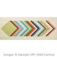
Do you remember the pretty card I shared with you a couple days ago? (see the bottom card in this photo or THIS POST)… well, I have 2 other versions for you today… isn't it neat how the card takes on a whole different feel just by using a different pattern from the Pretty Petals paper stack!?

You can see the products I used at the bottom of this post, but don't miss them in the new 2015-2016 Stampin' Up! catalog!:
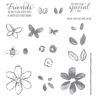
- Garden in Bloom stamp set, pg 119, or HERE in my online store
- Pretty Petals Paper Stack, pg 144, or HERE in my online store
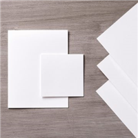
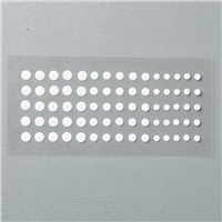
- White Perfect Accents, pg 161, or HERE in my online store
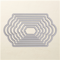
- Lots of Labels Framelits, pg 173, or HERE in my online store

See this post for details on stamping the Garden in Bloom flower stamp focal point for these beautiful cards.
You can achieve an entirely different look by changing the paper from this pack, and coloring your White Perfect Accents with a Black Sharpie marker!!!!!!!


So, which one was your favorite out of the 3?


Shop Online Anytime and Earn FREE STAMPS
Sign Up for my Customer Newsletter
SHOP: Clearance Rack – Weekly Deals – Promotions
Patty's FREE VIDEO tutorials
Take a Craft Room Video Tour!
Need a Stampin' Up! catalog?


Love all your cards, Patty, but I like the Thank You card with the darker background the best. Makes the middle section really pop.
I can’t decide if I like the one with the black background DSP or the one with the blue (Indigo?) accents best. I really like all 3. You’ve made the choice difficult. I guess I’ll go with the DSP with the blue accents – nice pop of contrast color.
Hard to choose I like all three but my favorite is the one with the dark background!
I like the one with the dark background, too.
My favorite is the darker background. Love the contrast.
I like the dark background with the black flower centers.
I have to say that my favorite is the one you made and posted first, several days ago. I love the deep blue accents in the patterned paper. However, I like the idea of making 3 versions and using them all!!! This would make a really cute card set for a gift!
I vote for the first one….the little flowers and the light background.
I like the dark background. Love the watermelon and coral colors with this.
I think they’re all beautiful, but my favorite is the one with the black background. The colors really stand out. Thanks for some great ideas using this DSP.
White perfect accents with the black sharpie looks beautiful. Thanks for ideas
The bottom one is more pleasing to my eye. Seems a better balance of color. They are all so pretty, but I vote for the bottom one.