Today I’d love to hear from EVERY ONE of you… please LEAVE A COMMENT HERE and tell me your favorite new 2026-2028 Stampin’ Up! In Color!
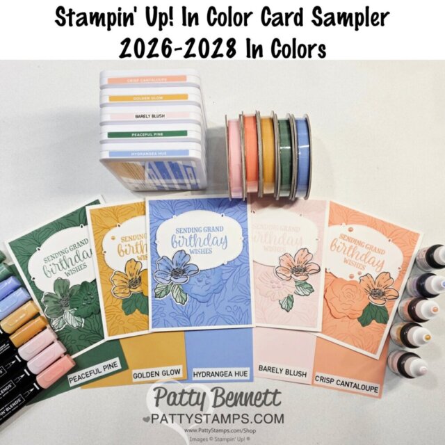
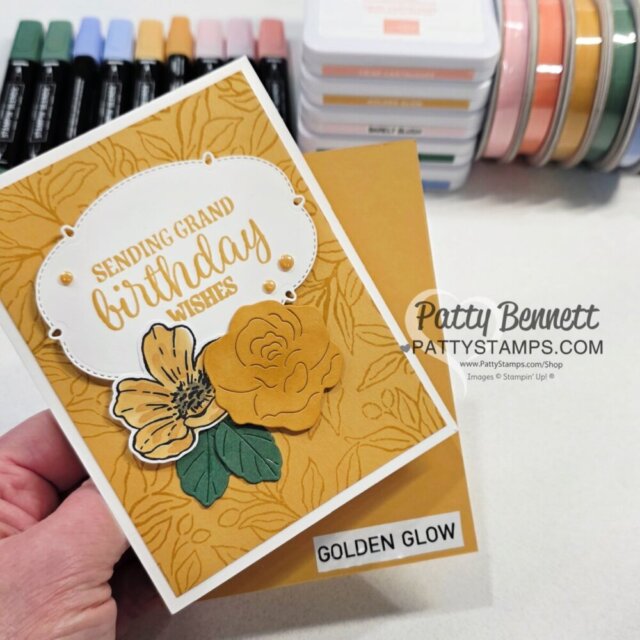
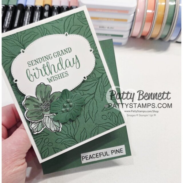
To help you see these gorgeous new colors, I’ve created cards featuring the Nature’s Frame background stamp, stamped in each of the 5 colors ON the coordinating In Color cardstock. I’ve also included flowers, along with a stamped greeting on the die cut from the Sweet Words and Labels dies.
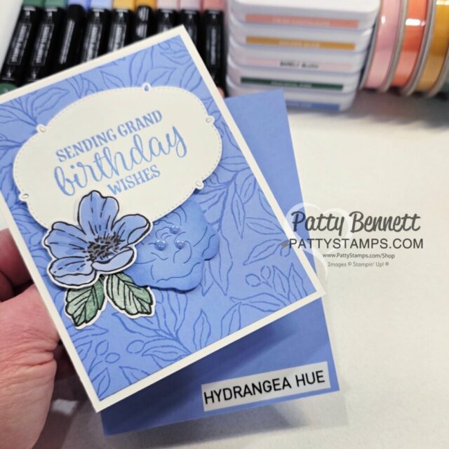
Above: Hydrangea Hue – it’s probably the fan favorite so far.. but I’d love to hear if you love it too!
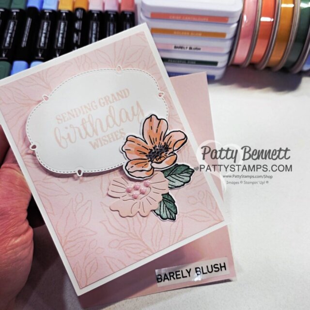
Below: Barely Blush – gorgeously soft pink!
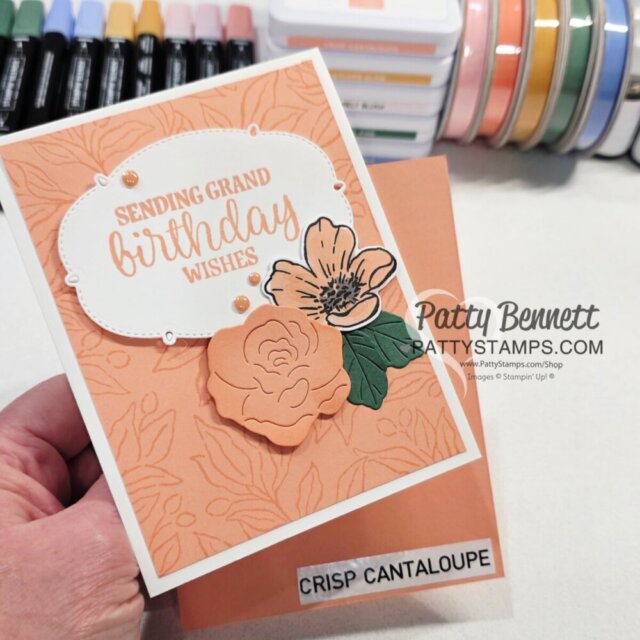
Above: Crisp Cantaloupe (my personal new favorite – which is odd because I’m not really an “orange person”.. but I love a good peachy pinky orange tone!)
Below: Golden Glow – this will be so perfect for the Fall!
Below: Peaceful Pine – stunning shade of green, especially for those like me who love a good “blue-green”. (or cool green).
All of the card supplies are listed below.. please click any link to purchase your Stampin’ Up! papercrafting supplies online.




Want to leave a comment? Please CLICK HERE.

Shop Online Anytime and Earn FREE STAMPS
SHOP and SAVE: Last Chance List
Join my Luv 2 Stamp Team of demonstrators – click for info
All my Favorites on Amazon - as an Amazon Associate I earn from qualifying purchases.
Sign Up for my Customer Newsletter
MY FREE VIDEOS tutorials
Hello Patty, I answer your survey, my favorite color of the new In colors is blue and rose, it’s difficult to choose between the two and in 3rd it’s orange.
Have a nice day!! Here in France it is very hot, especially in the city. Kisses
Sylvie
Hydrangea Hue
Hydrangea Hue
Peaceful Pine is my favorite.
I love this new set of colors. I think they are my favorite overall! I’ve been involved with Stampin Up for 5 years come September! I’m a blue / purple girl, but I also love the “peace” of the Peaceful Pine. I think it is a very calming strong color, but not in your face kind of green. But I’ll stick to the Hydrangea Hue! Thanks for all you do!
My favorite in-color is Hydrangea Hue!!
I love the Hydranga Hue!
Crisp Cantaloupe
Patty,
Hydrangea Hue.
I’m not a blue person, but the Hydrangea Hue is a beautiful color of blue.
Barely Blush is gorgeous! It’s my second choice.
Hydrangea Hue
I love all these new in colors. The Hydrangea Hue is very reminiscent of BoHo Blue, which EVERYONE loved, so I like the HH color. But my new favorite is Peaceful Pine. It is such a beautiful shade of green; I can’t wait to use it for Christmas’s cards. It gets my vote.
Hydrangea Hue is my favorite, and the others are nice, too.
Hi Patty
I really like all 5 InColors but Hydrangea Hue is likely my favorite! However to my surprise I have used the Peaceful Pine the most!
Hydrangea Hue and Peaceful Pine
Hydrangea Hue is probably my favorite color. But I like them all. I feel they coordinate well with one another.
Thank you for sharing all your creativity!!!
Hands down – Hydrangea Hue!!!!
All the new in colors are beautiful but my favorite is Hydrangea Hue.
Hydrangea hue is my favorite and I’m not a blue person.
Hydrangea Hue.
Hydrangea Hue
Peaceful Pine
Definitely hydrangea hue
Hydrangea Hue is my fav but a close second is crisp cantaloupe 😊
I have to say that Hydrangea Hue is my favorite, though Barely Blush is a close second! I love purples, pinks, and teals.
I like them all but Hydrangea Hue is my favorite. (I still miss Seaside Spray and Hydrangea Hue is somewhat similar.)
Barely Blush is my new favorite color. Thank you
Hi There,
No question for me, the Hydrangea Hue!! My favorite color has always been blue.
Thank you for all the beautiful cards and ideas Patty. Love them all!
Cathleen
Crisp Cantaloupe is my fav! I like all orange colors.
As a blue fan, so far it’s Hydrangea Hue
Definitely Hydrangea Hue. Can’t wait till we get moved, so I can order the new colors. I already have 12 totes of SU stuff going to South Carolina from NY. 😁🤣
I love them all. I think they’re the best that they’ve had for a while of the in colors.
Hydrangea Blue but I like the rest too.
If you look in my clothing closet you will know my favorite color is blue. However my vote is for the peaceful pine. These cards are pretty.
I think that the Hydrangea Hue is the best of them all and Peaceful Pine would be my second favorite.
My favorite is Hydrangea Hue, with Crisp Cantaloupe as a close second. Your cards are beautiful!
My favorite is Hydrangea Hue. I thought I’d love Barely Blush because I’m a pink person. Maybe I just need to see it used more. 🤷🏼♀️
Crisp Cantaloupe
Peaceful Pine is my favorite , I love greens !
Hydrangea Hue
Crisp Cantaloupe is my number one color but the combination of Barely Blush and Crisp Cantaloupe is what I love the most.
Can’t decide between peaceful pine and hydrangea hue!
The blue paper is beautiful!
I know everyone loves the Hydrangea Hue. But I’m partial to the Peaceful Pine. Crisp Cantaloupe is my second choice.
Hydrangea Hue!
Your pretty cards make it so hard to choose a favorite, but Hydrangea Hue is my first choice. Peaceful Pine is a close second.
Hydrangea Hue is my favorite.
Hydrangea hue. Love, love that blue.
I absolutely love Hydrangea Hue
Beautiful color
My favorite is Hydrangea Hue.
My personal favorite is Crisp Cantaloupe
Hydrangea Hue gets my #1 vote. Second place is Crisp Cantaloupe.
Peaceful Pine
Hydrangea hue, beautiful blue
Hydrangea Hue initially was my favorite, but I am loving Crisp Cantaloupe now.
My Favorite is Crisp Cantaloupe
Peaceful Pine
Hydrangea Hue is my first choice. Then Peaceful Pine.
Thank you for all your beautiful cards .
Peaceful pine!
My favorite new in-color is Hydranga Hue. It seems like a very versatile color.
It’s really hard to pick between the Hydrangea and Peaceful Pine. I was so very happy to see they brought back Crisp Canteloupe, which was one of my favorites. I hope they make these colors part of the regular line up and don’t put they away!!! So please forward these words to SU in hopes they will consider adding these to their regular line up of colors.
Hydrangea hue
Hydrangea Hue with Barely Blush as a close second!
Peaceful pine is my favorite so far!
Hi Patty…my most favorite color is Hydrangea Hue, but I have to say that this set of in colors is my favorite set of any we’ve had. I love them all. Peaceful Pine is awesome too
My favorite new “In Color” is Peaceful Pine. I’m from Washington, the Evergreen State, and am always looking for a good green. Peaceful Pine fits the bill this time around. 🙂
Favorite to stamp with — Peaceful Pine.
Favorite to wear —
Hydrangea Hue.
Looks like I may be the only one who loves GOLDEN GLOW!!! That’s followed closely by the Peaceful Pines green.
Hydrangea Hue by far is my favorite. Love it.
All of the new InColors are gorgeous this year. But I love the pine and hydrangeas colors.
My favorite new in color is Golden Glow. I LOVE a deep, rich, fall-like yellow and this seems like one (I’ve viewed it only on a computer screen thus far). I saw someone paint it with the Golden Glow Shimmer Pen and it was stunning!!!
Hydrangea Hue
Golden glow.
Hydrangea Hue, though I like the other colors as well.
Hi Patty!!
Because I’m all about blue, my favorite color is Hydrangea Hue.
Crisp Cantaloupe is my favorite-ever peach/orange. I still have stock from when it was one of the 2013-15 In Colors. Wish SU would bring back Pistachio Pudding from the same In Colors.
Peaceful Pine is a close third & I’m hoping it’s really close to the retired Wild Wasabi.
I’m holding out an opinion on Barely Blush because it looks really light.
Thank you for all your AMAZING videos & crafting tips!!! You are SO appreciated!
Peaceful Pine is my new favorite. Perhaps because I was born and brought up in New Hampshire and now live in Maine
Crisp Cantaloupe
Hydrangea Hue
Even though it is returning after some time, I really like crisp cantaloupe. Hydrangea Hue is my second favorite.
Golden Glow is my favorite color. This color seems to go with every other color. It was a hard decision to make. I love the returning color Cantaloupe Crisp and Hydrangea Hue for flower colors. Peaceful Pine is a great color for foliage. As for Barely Blush, it is barely a color.
Peaceful Pine!
Peaceful Pine
I’m loving the peaceful pines! I’ve always loved the greens:)
Love them all!
My favorite color is Blue so naturally my favorite In Color is Hydrangea Hue. It is so pretty.
I think I am more partial to the Crisp Cantaloupe if I have to choose one! I really like all of them, so it’s hard to choose a favorite.😊
Hello Patty
my favorite is Berely blush and then hydrangea hue
Thanks for your videos
Regards
Anne-Marie from France
Peaceful pine
Hydrangea Hue
Peaceful Pine
Its got to he Hydrangea Hue!
Hydrangea Hue is my favorite.
Love the hydrangea hue!
Hydranga Blue
The Peaceful Pine is my favorite. It looks like a true green. So many greens lean to the yellow. There need to be more that are really green or lean a bit blue. I have always liked Soft Succulent for that reason.
Hydrangea Hue
Barely Blush has turned out to be my most used new In Color (even though I thought it would be Hydrangea Hue) 🙂
Hydrangea Blue
Hydrangea Hue but I love Crisp Cantaloupe too. Glad they brought it back.
Golden Glow, however I do like them all.
Golden Glow
Hydrangea Hue
Hi Patty! Peacful Pine (today). It may change tomorrow, who knows!
My fav is Crisp Cantaloupe and Hydrangea Hue. Can’t decide between these two.
Hydrangea Hue (although it’s hard to pick just one!)
Hi! My favorite color is Barely Blush. However, Hydrangea Hue is a close second.
I really like all of them, but I have a tie for favorites: Hydrangea Gue and Crisp Cantaloupe.😀
Barely Blush
Oh my, do I have to choose? If I really do then I would choose Hydrangea Hue. I am a big blue fan. Love all your cards by the way.
i lke barely blush
Hydrangea hue
Crisp cantaloupe, but l like all of them
Peaceful Pine
Peaceful pine!!!
I’ll go against most and say that Golden Glow is a new favorite. Goes perfectly with the Silly Old Bear suite
Hands down, Hydrangea Hue! LOVE that color!
Loving the Peaceful Pine, and the new magnetic pads work so very well for me (have lost mobility in both hands from an accident, but can easily handle new pads, thank you Stampin Up!)
Hydrangea Hue is the one I lean to but they are all beautiful.
I like them all, but I’m happiest to see Crisp Cantaloupe back; it’s such a nice color and goes well with lots of other colors.
Golden Glow! I love the rich gold color that pairs so nicely with many colors.
It is very hard to choose my favorite. I have a tie between Golden Glow and Peaceful Pine.
Hydrangea Hue would by my third choice.
I like Hydrangea Hue, followed by Crisp Cantaloupe.
Peaceful Pine and Crisp Cantaloupe comes in second
Hydrangea Hue and Peaceful Pine.
Another I hope that never goes is Secret Sea.
Cheers from Gympie, Queensland Australia
Hydrangea Hue is my number 1 favorite but Barely Blush is beautiful also. I am a pink and Purple girl
I vote for crisp cantaloupe #1 and hydrangea hue #2
Hydrangea Hue is my favorite. But they are all beautiful including Barely Blush which is a close tie with Peaceful Pine.
I have to go with Hydrangea Hue also. It is just too pretty.
Christine
Hydrangea Hue is my favorite but I also like Barely Blush.
Golden glow!
Hydrandgea Hue
Crisp Cantaloupe
My favorite new in-color is Hydrangea Hue!
Hi Patty- on another topic, I’d like to join your group as a demonstrator, but am currently signed up with another upline. If I call Stampin Up and cancel my subscription today, how long would I have to wait before signing up with you?
Many thanks, k
Kathryn, I would like to know how that works as well. I would like to switch to be a demo under Patty too.
You can change uplines/groups in a couple ways. If your upline has dropped, you can drop and rejoin another demonstrator. If your upline is active, you need to drop for 90 days and rejoin with a new upline. You can find the info in the demo policies, or, talk to DS.
Golden glow
Hydrangea but i actually like them all, which is a 1st in awhile 😁
Hydrangea Hue is my fav. I love everything with purple
Peaceful pine
Hydrangea Hue is a beautiful blue! My most favorite color since Almost Amythest!
Peaceful Pine is my favorite color.
To my surprise it’s Golden Glow after using it alot! I thought it was gonna be Hydrangea Hue, nope. But hey, I love them all.
Hydrangea hue! So beautiful!
Hydrangea Hues
Hydrangea Hue, with Peaceful Pine a close second.
I’m a blue person. I love the hydrangea hue 💙
Peaceful Pine is mine. How can you not love a new beautiful green with all the foliage and leaf stamps Stampin up has? This one is a keeper.
Patt: Hydrangea Hue is my favorite. Peaceful Pine is my second favorite. You are such an awesome demonstrator.
Hydrangea Hue is my # 1 choice as it is the best blue SU has offered. Glad to see thay finally brought back Crisp Cantaloupe
Originally it was Hydrangea Hue as my favourite but Crisp Cantaloupe is such a pretty colour that I am leaning towards that one as my favourite
Hydrangea Hue is my favorite!
I love them all but hydrangea hue is my favorite
Hi Patty!
My favorite In-Color so far is Crisp Cantelope.
Have a great day,
Cindy
Hi Patty,
My favorite In Color has got to be Hydrangea Hue, with Peaceful Pine a very close second.
Hydrangea Hue
Thank you to the hardest working demonstrator for the color charts. My favorite is Cantaloupe.
You are so kind.. thank you!!
Peaceful Pine!
My favorite is Hydrangea Hue.
Hi Patty, thank you for the inventory sheets. This is a great tool to use. My favorite In Color is Hydrangea Hue followed by Barely Blush. I have enjoyed your latest video where you share the cards you made using the new Ephemera Mix & Match packs. Someone had asked what you used to store them in and you said you are using something that you have had for years. I went through some of my stuff and I found something that works perfectly. It is by Avery Elle. It is their large stamp & die storage pockets. The item number is #SS-5001 for a 50 pack. You can order on Amazon of course. The measurement is 5 1/2″ x 7 3/8″. The envelopes have a flap to close and the Ephemera Mix & Match fix perfectly. That is my two cent suggestion. Keep up the great work with your videos. Oh I ordered all the templates you suggested in your Amazon list and I love them! I couldn’t wait to make the circles on the Hydrangea Hue DSP.
Thank you!!
Hydrangea Hue, golden glow, crisp cantaloupe, peaceful, pine, and barely blushes last
Hydrangea Blue last the winner for me
Hydrangea hue is my favorite!
Peaceful Pine is my favorite
Hydrangea Hue
Love hydrangea Hue — could do without all the rest of the new colors — need a different violet/purple
It’s a toss up between hydrangea hue and peaceful pine
I just don’t understand why I have to have a masters degree in engineering to read a catalog. I just have been so disappointed with the last multiple catalogs. They are not helpful to me. They are not useful to me and they are not inspiring. I’ve been using stamping up now for 20 years and I feel kind of insulted by a lot of of the layouts in the catalogues and wasted space, etc. etc. etc..
If you are a demonstrator, please share your suggestions with Stampin’ Up! in the suggestion box. If you are a customer, please share your thoughts and suggestions with your demonstrator. I hope the catalog tour video I posted on launch day was helpful for you.
I just don’t understand why I have to have a masters degree in engineering to read a catalog. I have been so disappointed with the last multiple catalogs. They are not helpful. They are not useful and they are not inspiring. I’ve been using stamping up for 20 years and I feel kind of insulted by a lot of of the layouts in the catalogues, wasted space,, tiny images and fonts, I have loved and kept all my catalogs all these years but these little flyers, it’s just not helpful to me at all etc.
I hope my catalog tour video was helpful for you!!
https://youtu.be/grUkcK6ftNI?si=qRhOKoBmRK6juPsT
Hydrangea hue of course.
Hydrangea Hue. My favorite.
Hydrangea Hue is my favorite because of the cooling look of blue.